Since I started this glacially paced project, I’ve realised that book cover design is quite a distinct subset of graphic design, with its own Association (the Australian Book Design Association) and a number of tv shows and online lectures dedicated to it. Thinking about why this might be the case, I suppose that the book is a very particular object and the design that goes into it functions as both a marketing tool and an abstract representation of the contents.
This presents a specific challenge in itself, with the book designer navigating between the need to cater to the publisher’s nominated audience, provide an engaging graphic and accurately represent the story. I think the most satisfying covers are those that the reader refers back to having finished the book and is able to deconstruct; or, in fact, covers that continuously reveal more meaning over the course of the text.
Further than this, I think book cover design might be regarded as a more noble pursuit, more so than other types of package design. This is obviously linked to the book’s perceived role in increasing knowledge or experience, but from a design perspective there is also a certain prestige associated with both book ownership and construction that is a throwback to their pre-printing press origins. The book as a signifier of intelligence has never really lost its power, and honestly is one of the reasons I find myself hesitant to invest in a kindle.
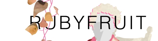
But back to the project. I have been toying with the cover of the book Rubyfruit Jungle, by Rita Mae Brown, and have found it more challenging than The Well to figure out a way to graphically depict the specific themes that the book centres on. As such, the smaller images above show a range of ideas that I have been working through. At this point however, I’m favouring the following:
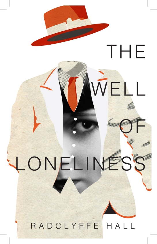
This year has been an educational one for innumerable reasons, but one of the more unexpected outcomes was an exposure to lesbian literature as it has evolved over the past century. Beginning with Carol by Patricia Highsmith, I have since ploughed through The Well of Loneliness by Radclyffe Hall, Fun Home by Alison Bechdel, Rubyfruit Jungle by Rita Mae Brown and am looking forward to The Night Watch by Sarah Waters, as I haven’t yet got my hands on Tipping the Velvet.
As I slowly make my way through The Canon, I’m starting to realise there is an unfortunate dearth of some of the more niche books due to limited print runs. After searching in vain for a copy of Stone Butch Blues for under $100 (I’m going to have to make do with a pdf copy, though not for lack of searching), it struck me that there is no structured approach in place for approaching the books as a cohesive series. *
I realise it’s problematic to try to pull disparate books into a complete collection under a single theme. This is particularly true as such a collection may appear to frame the works as inherently separate from the greater body of literature, as Rita Mae Brown points out in her 2015 forward to Rubyfruit Jungle. I suggest, however, that such an exercise may have its benefits.
I am thinking here of the potential for a structured, chronological and yet personal insight into the evolution of lesbian culture and its changing reception within society. While this is already the unofficial role played by the books, they are not currently organised and easily accessible for the reader and an official format and method of reading would likely increase clarity.
I am also considering the opportunity to leverage the reputation of more common books such as Carol (and of course to take advantage of publicity from the upcoming film adaptation) to increase reader interest in less accessible books purely by association. In doing so, one would hope that the publishers might bring out-of-print books back into circulation.
Of course I have no means with which to begin such a process, but I would propose that the first step is to begin with a cohesive and compelling graphic style that runs across the collection. To this end I have begun my own project of creating such a graphic style, which I will be updating as I slowly progress through my reading.
The first, lonely entry, and indeed the possible entry point to the series, is a reworking of the cover of The Well of Loneliness.
——–
Edit: I’ve since realised that Leslie Feinberg deliberately withdrew Stone Butch Blues from print in order to take it off the capitalist market, but I think there is still merit in promoting the books as chronicling the evolution of lesbian culture.
Sheer space is the ultimate psychological reward of America Deserta. – Banham 1982, 51
Documentaries focused on the life of Antarctic research stations are something of a very specific weakness of mine. This interest does not extend to documentaries about the wildlife of Antarctica, histories of Antarctic expeditions, nor modern day journeys to or over Antarctica. Unfortunately this specificity makes for quite a small list of films, so in order to continue to feed my thirst for this particular form of entertainment I have been forced to reflect on the thematic attraction the genre holds. Upon reflection, therefore, I have expanded my list and retitled it as follows:
Landscape: The Film; or, films about landscape, which are also films about nothing much
Werner Herzog’s Encounters at the End of the World
On my to-watch list, and ready to add to the above once approved, include Red Desert, Lawrence of Arabia and Zabriskie Point. I have also discovered a list of films that form some of the recommended readings of a Texas Tech course called Architecture at a Nameless Landscape, a course which in its description also presents one of my favoured terms for referring to such landscapes; isotropic. Truthfully, I am fascinated by isotropic landscapes, or landscapes that are identical in every direction, and do not make a major distinction between the range of conditions of such environments; I am equally appreciative of desertlike environments regardless of latitude, materiality or temperature variation.
Reyner Banham attempts to capture and understand this fascination with isotropic landscape as they occur in America in his 1982 essay The Vast and the Empty. He states,
that is the great pull of the desert for so many of its fanciers – the great calm vacuum of supposed respite from men and their works. “The desert is where…man is not,” (Banham 1982, 56)
Further on in the text he examines this idea and concludes that
I have derived a deep suspicion that what is really at stake is not solitude as such, but the avoidance of pollution or contagion from other people. (Banham 1982, 57)
As Banham points to isolation on a physical level rather than an emotional level, I am reminded of Nancy Holt’s Sun Tunnels and the connection they draw between the vast and emptiness of their desert location and the vaster and emptier space they connect with beyond the Earth through their alignment with the solstices. Perhaps the draw of the isotropic landscape is its inhumanness, not situated in its hostility but its otherworldliness, its suggestiveness of things far greater than the human scale. Its lack of markings and divisions serve to place us outside the constructed scale of the urban and even the rural, reminding us that the grids we live by are superimposed on an existing terrain which has no predisposition towards any scale other than the geologic. Like the shiver of insignificance that comes from considering the vastness of space, the empty landscape prompts awareness of not only the spatial but also the time scale.
Such an underlying interpretation of the isotropic landscape would certainly help to explain why such static and yet people-focused films are of interest. Why focus on McMurdo Station when the film could be endless shots of the landscape? Because in isolation it does not have the same effect; it requires the limited presence of humans to give a comparative scale and industriousness that contrasts with the ‘great calm vacuum’. Just as Nancy Holt uses the industrial pipe as a framing device to connect viewer with sky, creating connection and logic by isolating a single event within the billions of celestial movements, so McMurdo Station acts as a framing device for the enormity and apparent chaos of the Antarctic.
Nancy Holt’s 1976 Sun Tunnels, image courtesy Center for Land Use Interpretation
I have been struggling with the idea of autoethnographic reflection / writing, trying to understand its purpose beyond the immediate exploration of space through the medium of the senses and the body. It is understandable that an accurate discussion around sensorial encounters can only be explored comprehensively from a personal perspective, however I have not been able to grasp the full implications of the use of the body as a storytelling device. Indeed, the writing style seems highly indulgent at surface level. As I continue to read, however, it is becoming clearer that one of the primary purposes of the style is to situate the discussion within the world and so make obvious the agency of the writer in telling the story and influencing the reader toward a biased, or simply a particular, perspective.
[R]esearch should be framed as the exploration of situated knowledges where the researcher is accountable to their positionality and acknowledges their role in knowledge construction… (Ruming 2009, 455)
In light of this argument the use of a personal narrative of experience seems reasonable; perhaps even a more honest method of presenting a concept or research to an audience. I do not know whether this is the underlying premise behind use of the body within feminist literature. Haraway argues ‘for the view from a body, always a complex, contradictory, structuring, and structured body, versus the view from above, from nowhere, from simplicity’ (Haraway 1988, 589), however this view from a body only seems applicable in certain situations that look to engage partiality. By arguing from outside the god’s eye perspective it is both awarding agency to the writer and removing their authority to speak beyond their specific experiences.
While I am beginning to understand the implications of parallel/partial/situated stories/knowledges in relation to an object or event (an actant?), there seems to be the problem of the core of the object. If it is not possible to ever actually see an object without a framework of preconception, is there a true object? Is it worth considering it at all, or is it just an idea to be discarded because of a lack of access to an answer? This is related to the idea of correlationism discussed by Sheldon; as she quotes from Meillassoux, correlationism is ‘the idea according to which we only ever have access to the correlation between thinking and being, and never to either term considered apart from the other’ (Sheldon 2015, 193), or are forced to ‘dramatically limit the range of theoretical speculations to things that fall within human knowledge systems’ (Ibid., 194). So we use the body as a device for making evident the restrictions placed on our thoughts?
References:
Haraway, D. (1988). “Situated Knowledges: The Science Question in Feminism and the Privilege of Partial Perspective.” Feminist Studies 14(3): 575-599.
Ruming, K. (2009). “Following the Actors: mobilising an actor-network theory methodology in geography.” Australian Geographer 40(4): 451-469.
Sheldon, R. (2015). Form/Matter/Chora: Object-Oriented Ontology and Feminist New Materialism. The nonhuman turn. R. A. Grusin. Minneapolis, University of Minnesota Press: 193-222.
I watch the theatrical entrance sequence of this second Earth tiredly, as the routine of it has worn the novelty off. These days I get annoyed that the dizzying spinning requires extra patience to sit through, as the globe emerges from the starry blackness that symbolises space. As it settles and resolves into its recognisable form, I swing my mouse over to Places and check which layers are already turned on. Resizing the panel I can see that Operating Mines in Australia (2014) is active, but not History of Mining in Australia. Satisfied with this format, I return the panel to its original size and turn my attention to the world.
Somehow the program has realised that my interest lies in Australia, as the continent sits directly in the centre of my viewing angle. Taking up my scroll wheel I turn it with a gentle confidence that enlarges the country until it all but fills the view screen. Now the difficult part; where to go? There are so many dots accompanied by illegible titles on my screen, filling the reddish texture of the ground like a rash. I find myself focusing on the lower half of Western Australia, as the area with the highest concentration of sites. Dragging this region to the right I focus it in the middle of the view window and again employ the scroll wheel. Closer I fly until I can make out the names paired with the dots, until they’re about 18, 20 pt. Sons of Gwalia, I read, Plutonic East, Challenger – Mt McClure. This last one calls to me, as a memory of the Challenger space shuttle tragedy overrides my interest in this selection process.
Clicking the dot that shudders as I hover over the Challenger text, a label pops up:
Challenger – Mt McClure
Name: Challenger – Mt McClure
State: WA
Longitude: 120.969500
Latitude: -27.566000
Commodities: Gold
Websites:
A gold mine. Pleased with this choice, I double click the Challenger dot and watch the animation as the smooth automatic zoom towards the site is complimented by a switch from the satellite view to that of the oblique aerial. Although I know this is simply a computer generated change in perspective, I can’t help but thrill in the sense of presence that it allows me. It’s as if I’m really flying over this desert country, watching the horizon come closer as I move forward and down.
From this angle Challenger looks small and unassuming, like the outline of a cul-de-sac for a town that was never built. Pulling myself forward and down further toward the earth I can make out small pits, with their dark shadows and pit water making their depth. Behind the site I can see a faint grid pattern in the dirt, stretching into the distance. I wonder at the scale and the purpose of the lines. Scrolling in the picture becomes increasingly pixelated, and I realise I can make out nothing more clearly than when I was zoomed out.
Disappointed with this discovery, and because the site seems somewhat underwhelming beyond the mysterious lines, I turn my attention to the dark patches further up the road. Coming to the first of them I am intrigued by the light blue colouring that seems to be spread over a large section of the ground. Again it’s difficult to make out, but my memory supplies me with a story I was told yesterday relating to a blue mineral that is highly prevalent on an island in Greece, making the surface of the island a shade of blue. I am unable to find any evidence of this online, but blue seems to be a common colour in relation to Greece. I assume that this is irrelevant to the blue of the mine, but my mind grasps at the connection regardless.
Moving closer to the pit I find an anomaly in the bench structure. It seems to be some form of vegetation and rubble. Subsidence? A strange attempt at rehabilitation? I assume the former. I look at the clock, and it is time to leave. I consider extricating myself methodically from my current view by reversing my trajectory and returning to low earth orbit, but it seems unnecessary. Instead I hit the red X and face a series of tabs in chrome and a sense of loss.
Opened in 1985 on the site of an abandoned and highly acidic strip mine next to the Illinois River at Buffalo Rock, Michael Heizer’s Effigy Tumuli is a curious divergence from the sculptural forms that dominate his practice. The only large-scale earthwork he has completed that is not composed of abstract geometric forms, but the recognizable outlines of five animals (snake, water strider, catfish, frog and turtle), Effigy Tumuli at first glance appears conceptually weakest of Heizer’s works, but can be understood as perhaps the strongest example of the underlying motivation for his practice, as well as the experience he seeks to evoke in the viewer.
Catfish sculpture, Effigy Tumuli.
As Bourdon[1] reported in 1986, Heizer developed the work in response to the location, its local biodiversity and regional history. The animals are intended to reflect common species from the area, and the concept of the effigy itself is a reference to prehistoric Native American mounds largely concentrated in Ohio, Illinois, Wisconsin and Minnesota. The unprecedented level of obvious contextualisation that Effigy Tumuli exhibits have been justified in a number of texts as reflective of Heizer’s own history, with his father’s expertise as an archaeologist specialising in petroglyphs cited as motivation for the forms[2].
Map of Effigy Tumuli from Illinois Department of Conservation. Document provided by Illinois State Archives.
While Heizer’s experience with archaeology likely is the origin of the forms, the work itself has a much broader intention, exemplifying the ‘diffracted gestalt’ theme of Heizer’s overall body of work in a far more tangible way than had previously been available. By presenting such expansive figurative shapes, the viewer on the ground is able to experience only small sections of each sculpture at a time. For the viewer who wishes to understand the form, this method of experiencing the sculptures requires a slow build-up of information which she is obliged to convert into an experiential map; what Heizer refers to as a ‘chronological development of perception’[3]. Unlike Heizer’s other entirely abstract forms, however, Effigy Tumuli promotes an objective of full comprehension from the ground by presenting figures that can be ‘seen’ as the end product of the experience.
Severely eroded traces of Las Vegas Piece from Land Arts of the American West.
It is this same development of perception that appears to be the motivator for Walter de Maria’s Las Vegas Piece, a square-like diagram in the Mojave desert formed through connecting trenches, each ‘a foot deep, two feet deep and about eight feet wide’[4]. The outcome of Las Vegas Piece differs from Effigy Tumuli, however, in that by exploring the former the intention is to become familiar with all the proportions and relationships over a period of time, a sense of being within, whereas the latter seeks also to challenge the viewer with a mission to mentally assemble the whole by virtue of the experience of being within. I would posit that there is an attachment to the aerial and the cartographic in Heizer’s work that is absent in de Maria’s, and this becomes particularly apparent in Effigy Tumuli.
References
[1] Bourdon, D (1986) Working with earth, Michael Heizer makes art as big as all outdoors, Smithsonian 17:1, 68- 76.
[2] Dreher, T (1992) Robert Smithson: land reclamation and the sublime, Artefactum 9:45, 26-30.
East China Sea materialises the irrelevance of nature within humanity’s globalised industry. Taken during a crossing between Busan and Shanghai, two of the world’s busiest ports, the image captures the simultaneously concrete and yet amorphous existence of the contemporary shipping lane. Independent of reality, its cartographic life marks it as indisputably material, as the vessels traversing the lane observe its presence through GPS and paper charts. Within the photograph, the soft monotony of the sea and sky, merging to form a continuous background, provide a stable platform over which the cargo ship asserts its presence, reflecting nature’s peripheral role in a digitally systemised world. The soft wakes to the left of the ship stand as both tangible impressions of the shipping lane’s artificial demarcation and as symbolic of the domestication of the sea in the name of efficient freight transport.
East China Sea was captured during a journey along the shipping lanes between two of the world’s busiest ports, Busan and Shanghai. The image addresses a confrontation between the scale of humankind and the scale of nature, demonstrated by the prominent section of the cargo ship set against what appears to be a limitless sea as it seamlessly merges with the overcast sky. The heavy presence of the shipping containers is subtly supplanted by the unobtrusive ubiquity of its monochrome environment, encouraging the viewer to consider the balance of power between the two. The ship is a symbol of the scale and industry that humanity is capable of, and yet, within this image it seems as if the muted sea through its sheer, unbounded presence, holds a latent energy that effortlessly eclipses that of our most elephantine endeavours.
After Rain #1 is the first of a series of photographs taken during an expedition through Mainland China. The desolate landscape depicted within the image is one of a number of tailings lakes that service the region around Baotou, in Inner Mongolia. Known for its production of rare earth minerals, the photograph serves as a striking reminder of the residual impact left by the human drive for technological advancement. The solitary figure reinforces the otherworldly nature of the landscape and heightens the sense of scale, eliciting questions around the legitimacy of control. Could the environment that we are creating also consume us?
After Rain #1 is the first in a series of highly theatrical photographic works that collectively evoke a sense of foreboding, through the presentation of what appears to be a near-future dystopia. Never explicitly confirming themselves as fictional, the images provoke doubt over the assumed timeframe and rely on the viewer’s existing knowledge of science fiction and post-apocalyptic themes in popular culture, as well as the current spectre of environmental concerns, to coalesce as a narrative that saturates the photographs and generates a dramatic backstory.