Since I started this glacially paced project, I’ve realised that book cover design is quite a distinct subset of graphic design, with its own Association (the Australian Book Design Association) and a number of tv shows and online lectures dedicated to it. Thinking about why this might be the case, I suppose that the book is a very particular object and the design that goes into it functions as both a marketing tool and an abstract representation of the contents.
This presents a specific challenge in itself, with the book designer navigating between the need to cater to the publisher’s nominated audience, provide an engaging graphic and accurately represent the story. I think the most satisfying covers are those that the reader refers back to having finished the book and is able to deconstruct; or, in fact, covers that continuously reveal more meaning over the course of the text.
Further than this, I think book cover design might be regarded as a more noble pursuit, more so than other types of package design. This is obviously linked to the book’s perceived role in increasing knowledge or experience, but from a design perspective there is also a certain prestige associated with both book ownership and construction that is a throwback to their pre-printing press origins. The book as a signifier of intelligence has never really lost its power, and honestly is one of the reasons I find myself hesitant to invest in a kindle.


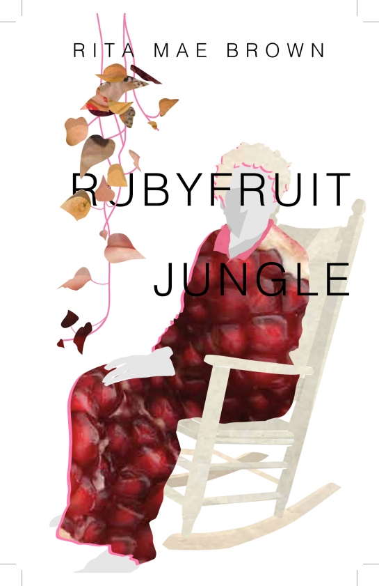
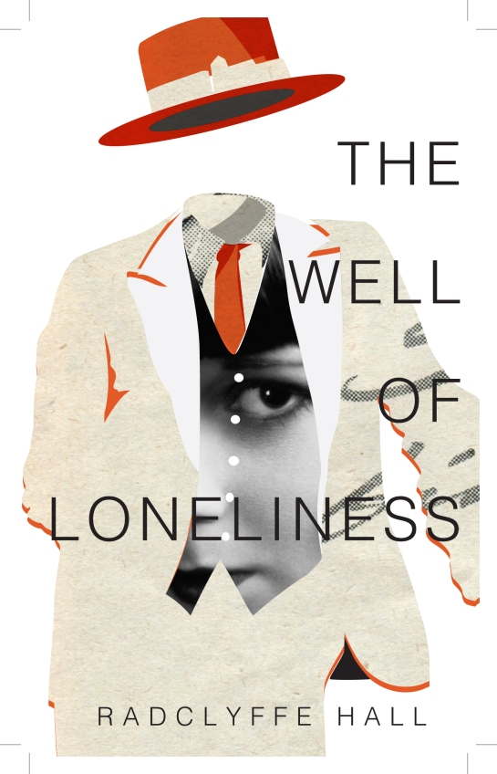
But back to the project. I have been toying with the cover of the book Rubyfruit Jungle, by Rita Mae Brown, and have found it more challenging than The Well to figure out a way to graphically depict the specific themes that the book centres on. As such, the smaller images above show a range of ideas that I have been working through. At this point however, I’m favouring the following: